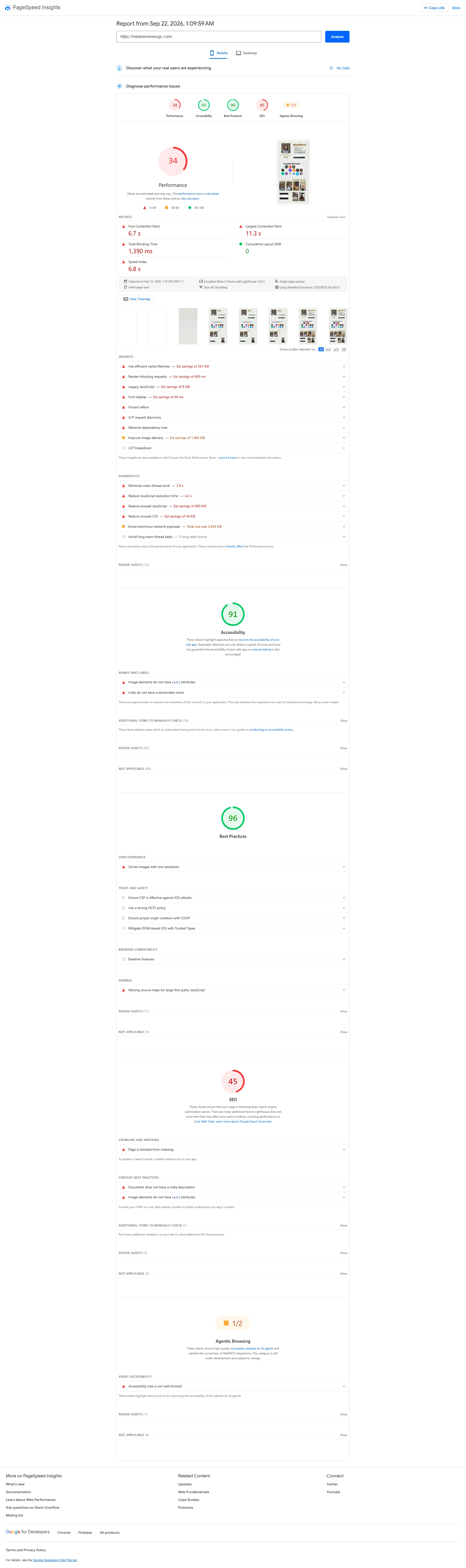
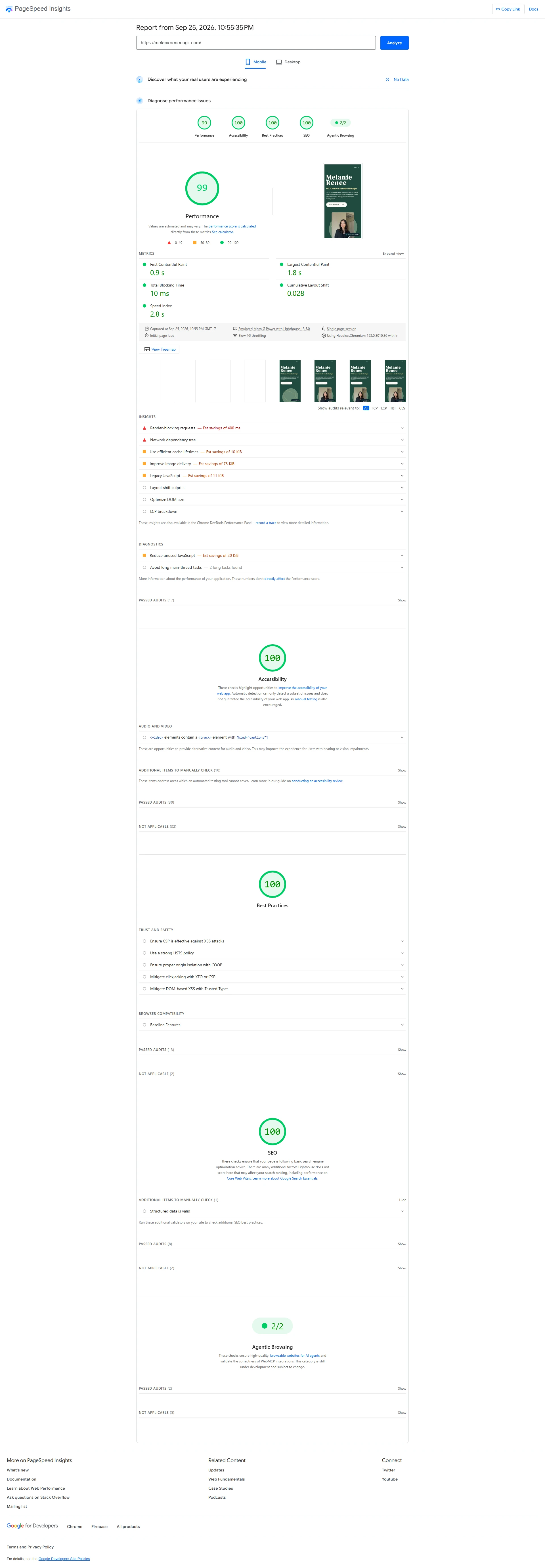
Mobile performance score: 34 to 99. PageSpeed lab evidence alongside a portfolio rich in video content. Mobile, Moto G Power, Slow 4G. Test times and Lighthouse versions differ (13.4.1 / 13.5.0); these are not real-user measurements.
The live website may differ from the version documented here.
Redesign / HomepageOpen the image to view the full page
FocusPortfolio website design, work selection, and service structure.
CoverageDesktop and mobile views.
ProjectPortfolio website for a Los Angeles creator. Visit Website
From 34 to 99 in mobile performance tests.
The redesign retains space for video work. The two available PageSpeed Insights reports record mobile performance scores of 34 before the redesign and 99 after it.
Before34
After99
Mobile Performance Scale of 0–100 · PageSpeed Insights
Lab Test Results
Metric
Before
After
First Contentful Paint FCP
6.7 s
0.9 s
Largest Contentful Paint LCP
11.3 s
1.8 s
Total Blocking Time TBT
1,390 ms
10 ms
Cumulative Layout Shift CLS, unitless
0
0.028
Both reports use Moto G Power emulation with Slow 4G for the initial page load.
These are mobile lab results from the two available reports. Test times and Lighthouse versions differ; neither report provides real-user experience data.
This is not a controlled test. CLS changed from 0 to 0.028, which is not an improvement. Lab scores do not establish conversion gains or a real-user Core Web Vitals pass.
Report crops of 1050 × 1220 pixels are displayed at the same width. Enlarge a crop to inspect the details, or open the full report screenshot.
The content was already there. The structure changed.
The previous portfolio already included work, reviews, services, and contact details. The redesign changes how they are introduced, with a personal profile first and selected work directly after it.
Before
Desktop
The introduction and varied content examples share a dense composition.
Redesign
Desktop
The portrait has its own space beside the creator’s role and an invitation to view the work.
Opening page views, each 1920 × 1200 pixels, are displayed at the same width. Open the images for the full context.
A personal identity, with the work in focus.
Dark green frames the portrait and introduction. Ivory sections give the work room to breathe, with serif headings linking the sections. The "View My Work" button places the invitation to explore the portfolio at the top.
Selected work first, a gallery to explore further.
The homepage presents selected work before linking to a dedicated UGC gallery. Paid Ads and Organic categories group content examples by their use.
Brands can review delivery style and content types when considering a collaboration.
Paid AdsOrganic
The work, campaign figures, and testimonials in the screenshots belong to the creator’s portfolio.
UGC Gallery / Full-page Screenshot
Service Details / Homepage Crop
Each service gets its own explanation.
Creative Strategy, Influencer Collaborations, and Social Media Management appear in separate blocks, each with a description and accompanying photos.
This explains the types of collaboration after visitors have seen examples of the work.
A sequence that fits a phone screen.
A video-rich portfolio needs work that is easy to browse, readable text, and touch-friendly controls. Google’s responsive design guidance helps structure small screens; its Web Vitals guidance explains why loading and responsiveness matter when visitors review the work.
Globally, mobile accounted for 49.36% of page views in Statcounter’s sample in August 2026. See Statcounter’s global data.This is global web usage context, not this website’s audience breakdown.
In the earlier crop, several elements sit in a dense column layout. The redesign stacks the introduction, buttons, and then the portrait.
Work remains in two columns in the latest mobile screenshot; each service has a separate section.
Redesign · 330 × 825
Opening views at the same size. Open the image to inspect the full mobile screenshot.
The gallery has room on mobile.
Paid Ads and Organic retain the work categories. Open the screenshot to review the full mobile gallery.
A collaboration form closes the homepage. Visitors can get to know the portfolio and services before discussing their project needs.
Contact Section / Interface Capture
A website that introduces the work before the conversation.
Lithe organized the visual identity, work, and services to give brands a basis for judging collaboration fit.
The screenshots document the interface. Video playback, form submission, and business impact were not tested in this case study. Campaign figures and testimonials in the screenshots are not redesign outcomes.
Allow Google Analytics to measure visits, contact clicks and CTA tests when enabled? Your choice and any test assignment last up to 7 days. You can use the site if you reject.
Privacy Policy · Change your choice anytime in the footer settings.